BLOG
In the flow

Understanding the direct link between business communication for fostering a sense of belonging with employees and maintain alignment, is not a new concept. What is a newer trend is C-Suite directing Comms not to use email for the delivery of important company news - with global, hybrid and remote working, what is the solution? If your business runs on Microsoft 365, the answer lies in utilising SharePoint’s News feature to streamline and elevate your internal communications. Here are three reasons businesses should make SharePoint News their go-to platform for posting important company updates. 1. Centralised Communication for Easy Access When important news gets buried in email threads or lost in the clutter of chat messages, critical information can easily be missed. A study by Gallup found that companies with high employee engagement are 21% more profitable, and SharePoint can be a crucial tool in driving that engagement by offering transparency and ease of access. SharePoint News solves this by centralising your company updates in one easy to access place. Employees can visit your SharePoint site at any time to catch up on what’s happening, whether it’s a new product launch, policy change, or an exciting event. If you are consistent with posting news to SharePoint, your employees will be equally consistent checking for updates. 2. Increased Visibility and Engagement Posting company updates to SharePoint News boosts the visibility of important information. Unlike an email that might get lost in a crowded inbox, News posts are front and centre on your intranet homepage. SharePoint also allows you to customise notifications, so employees get real-time alerts when news is posted, ensuring timely engagement, you can also encourage teams to follow relevant pages so the never miss an update. 3. Drives Engagement and Outcomes SharePoint News doesn’t just inform your employees; it actively engages them. By allowing users to comment, like, and share news posts, you create a feedback loop encouraging employees to participate in discussions and share their insights. Drive real outcomes by fostering collaboration and ensuring that updates translate into action. When your team is more involved, they’re more likely to understand and execute on the company’s goals. 4. Building Culture By having all the stories in one place employees see them every time they enter the site. New starters can see a history of news and understand instantly what’s happened in the period before they joined, gaining a deeper understanding of the business and department they have joined. When everyone feels empowered to contribute, the organisation benefits from improved clarity and stronger collective outcomes. So, for businesses looking to improve internal communication, posting important company news to SharePoint is the future. It ensures that your team has easy access to the latest updates, increases employee engagement, and drives meaningful outcomes. Whether you’re managing a remote workforce or a tight-knit office, SharePoint News keeps everyone aligned and informed - key ingredients for long-term success.

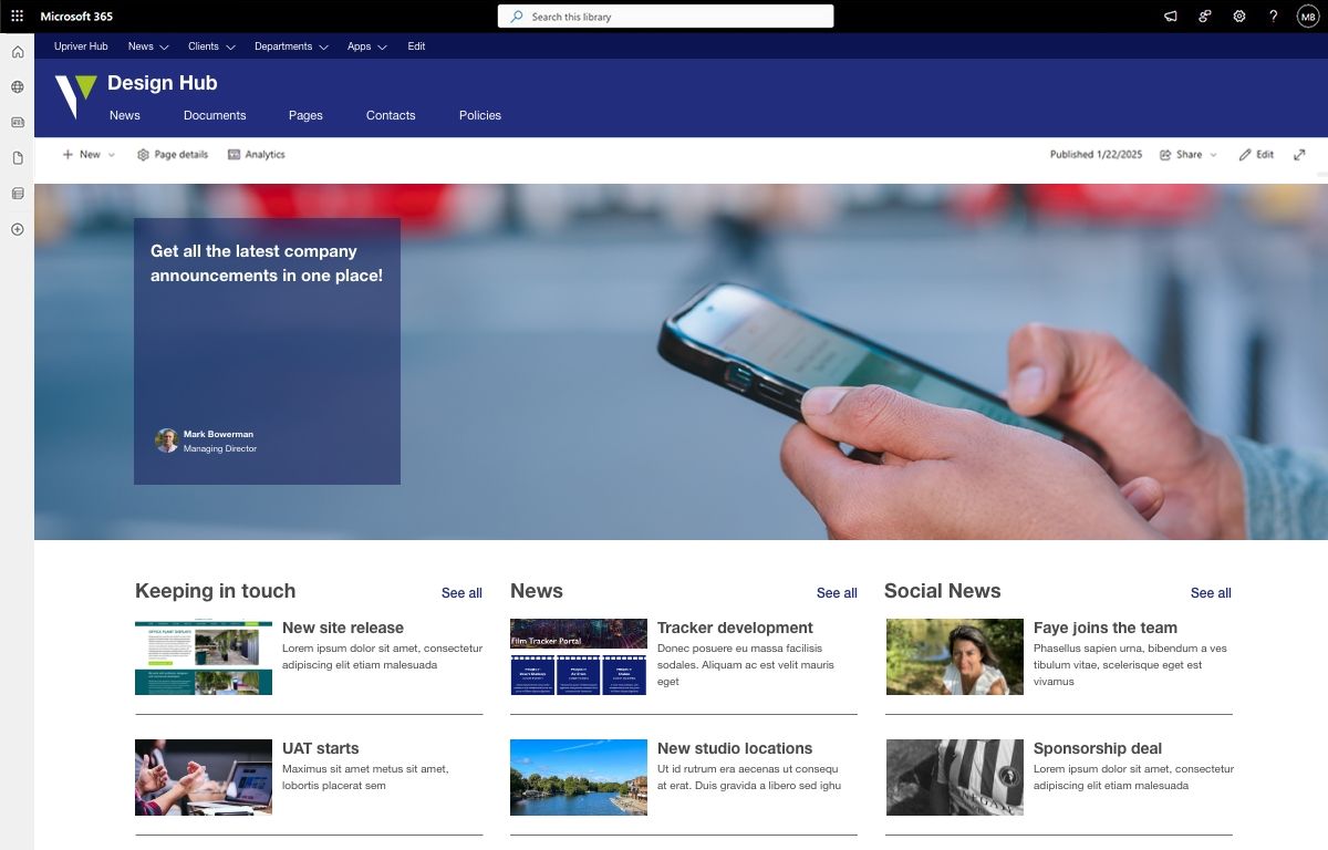
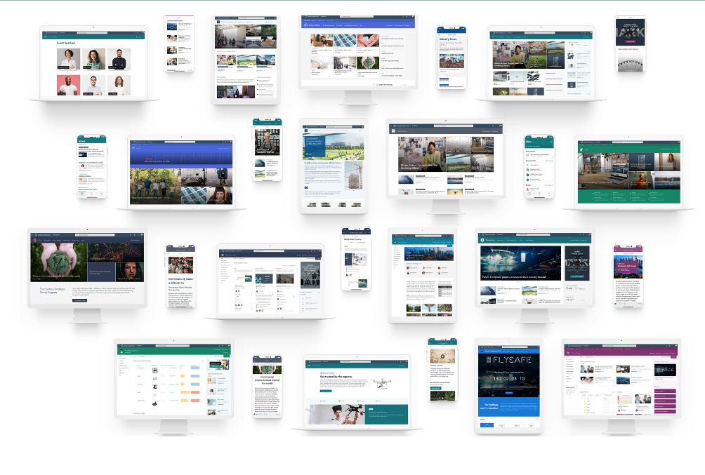
You would never think about having an external website without design, your internal SharePoint should be no different. Employee engagement is the cornerstone of any successful business. Yet, 30% of internal comms, HR, and senior leaders see it as a continuing challenge in 2024. Designed correctly – with your employees needs at its core – your SharePoint intranet should be a first port of call when logging on at the start of the working day. A personalised home screen with portals, resources, news, events – and so much more – will give your people the confidence that they are ‘plugged in’ to what’s going on, regardless of where and when they’re working. When building your SharePoint intranet, you can add lists, libraries, and hundreds of other apps to give your employees instant access to all the tools and information they need to stay connected and productive wherever they are working. 1. Use Images for a visual experience Images can really enhance the user experience by guiding people to the content their looking for, or the task they are completing. Bold headlines will allow users to scan and skim your page faster. Facilitating an easy journey to the information they need will negate frustration and drive engagement. We often find that authors complain about images in SharePoint, but SharePoint Modern has a great Image Editor which has been further enhanced in 2023 with greater editing capabilities including cropping to common aspect ratios and adding text overlay. Images are typically owned and maintained as part of an organisations brand. We recommend adding the Organisational Assets Library to the picker which gives authors access to a library of photos, logos, and icons. This sits right next to the Stock images and Web search in the image picker. 2. Plan to use horizontal space There is no left navigation bar on SharePoint Communication Sites, providing more horizontal space to work with than older SharePoint versions. This offers three column layouts and using multiple news parts on a News landing page facilitates clearly displaying categories of news, aiding quick navigation. 3. Use Different Link Styles Quick Links are an excellent feature and used effectively create an easy-to-read library of information at one click. It is common to use it multiple times on the same page. There are several ways to display your quick links. • Apps ‘pinned’ to a page in a button format with icons and descriptions • Images added to a grid create a great visual experience • A grid view of links with icons • A simple list of related documents with small icons to indicate the link type Whichever style you choose, providing your authors a starting point of Quick Link styles in page templates, will deliver some consistency across the site. With training and examples, you can inspire people to create visually appealing and useful lists that drive engagement within their teams. 4. Add sections to break up pages Sections are an excellent feature that were not available in classic SharePoint. You can use sections to break up pages by columns and colour. There are two special sections that can only be added independently of each other: Full-width section and Vertical section. In other words, the full width section can be added to a page that isn’t using a Vertical section and vice versa. A 2023 update includes section templates which are now available when creating pages and news content. Section templates give a quick start to creating content using sections, with pre-defined layouts. Use them in different combinations to create your own section layouts. 5. Go further with collapsible sections Another enhancement to Sections is the ability to expand/collapse sections. This is an effective way to break up a page that has detailed content such as tables or historical material. Hiding this information allows the user to drop down only relevant information they require. Use the power of SharePoint SharePoint pages have been developed to be more easily edited empowering authors to create appealing visual pages, enticing landing pages that link to other areas, or display data rich content in an easy to read and scan format. Modern pages have really moved forward and been improved from previous SharePoint versions, and so now is the time to get rid of PDFs and move that content to pages instead.

This is a mural commissioned by The Big Hearts Project and was recently unveiled in Lancashire. Its inversion has caused some discussion. The Argentinian artist Seba Cener is renowned for painting upside down to "change people's perspectives" The mural which was commissioned in the fishing town of Fleetwood. It is to appreciate the local fisherman who risk life and limb to bring back food to the local community and who have no sense of time of when they will be back into their families arms. The Big Hearts Projects was created by The Butterfly Effected CIC and hosts arts therapy workshops, mural projects, and outreach programs. Their spokesman said "these murals do more than beautify areas, they will spark important dialogue surrounding issues such as addiction, mental health, LGBTQ+ rights and child poverty. Bringing down stigmas and bringing us closer together." Well it made us stop and think and has sparked a conversation in our office this morning. Design, when used effectively, is engaging and thought provoking. It has divided opinion with the locals in Fleetwood too, some baffled by the upside down image and others loving its difference and what it represents. Engagement is powerful and a critical concept in every business and every life.

In today's fast-paced business world, ensuring the success of your digital workplace starts with an effective intranet solution. For your employees to truly adopt and benefit from the platform, it must solve real challenges and offer better solutions than alternative technologies or communication channels. A modern intranet should not only drive productivity but also nurture company culture and streamline communication. 10 Ideas to Drive Employee Engagement on Your Intranet The battle to attract and retain top talent goes beyond just offering competitive pay and office perks. Employees need to feel a deep connection to their organisation’s mission and be engaged in its success. Your intranet is the perfect platform to build this connection, foster collaboration, and drive productivity. Here are ten ideas to enhance engagement: 1. Keep it Current Keep your employees informed by providing regular updates and alerts through push notifications, pop-ups, or ticker feeds. It’s important to give employees the option to manage these notifications to prevent information overload. 2. Recognition and Appreciation Employees need to feel valued, and an intranet can help combat feelings of invisibility. Implement recognition features like badges, shout-outs, and peer-to-peer acknowledgments to foster a culture of appreciation and engagement. 3. Social Features for Connection Social features such as liking, commenting, and tagging are great for fostering a sense of community. Incorporating forums or Q&A sections also enhances collaboration, transparency, and communication between teams. 4. Personalisation for a Tailored Experience Personalised experiences drive higher engagement. Tailor content based on an employee’s role, location, or department, and allow users to customise their dashboards and notifications. This makes the intranet more relevant and user-friendly. 5. Promote Usage and Awareness Maximise intranet usage by promoting it through various channels, such as newsletters, internal emails, or social media posts. You can also designate intranet champions and create video tours to onboard new users. 6. Provide Training and Development Resources Offer employees opportunities to grow by providing training and development resources via the intranet. E-learning modules, knowledge repositories, and career development tools show your commitment to their growth, encouraging frequent visits to the platform. 7. Encourage Community-driven Content Invite employees to contribute to the content ecosystem of the intranet, keeping it fresh and engaging. Employee-generated content not only adds variety but also encourages a sense of ownership and pride within the community. 8. Seamless Integration with Business Tools For the intranet to be a true productivity booster, it must seamlessly integrate with other business tools, like Microsoft Teams, the Outlook calendar, HR tools or project management platforms. This centralisation of tools reduces friction in workflows. 9. Optimise for Mobile Accessibility As flexible working still features heavily in our workspaces, it’s vital that your intranet works flawlessly on smartphones and tablets. Optimising for mobile devices ensures that all employees, especially those working remotely or in the field, stay connected and engaged. 10. Onboarding New Hires Effectively The intranet is an excellent tool for onboarding new employees. Use multimedia content, tutorials, and interactive elements to introduce new hires to the platform, helping them understand its value and use it from day one. A modern, well-designed intranet isn’t just a digital tool—it’s a key driver of productivity, culture, and communication within your organisation. By focusing on ease of use, engagement strategies, and seamless integration, your intranet can become a powerful asset that promotes collaboration, nurtures a sense of community, and supports your employees in achieving their best work. How does your Intranet shape up?

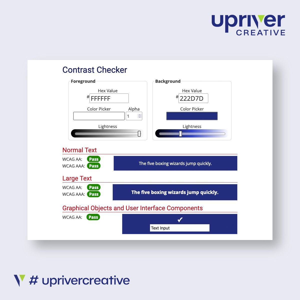
Understanding clients, their culture, policies and strategy is key before any designer even looks at the blank page. Working within the Brand guidelines is a must, but creating a left field idea in a group of designs offers the client choices. One of the biggest compliments from a client, is when they say: that “You gave us something we didn’t know we wanted" – because that is where the value is truly added. In addition to Brand Guidelines, businesses also have inclusive design and marketing policies, for both internal and external communications. However, it is simply not enough to read them and try to and tick the boxes. Smart businesses want design agencies that go far beyond compliance and are looking to collaborate with an agency that values Diversity, Equity & Inclusion (DE&I) as an intrinsic part of their design thought process, naturally included in every image, colour, font and spacing decision. Accessible design does not constrain creativity, it drives it. Diversity of all types deserves to be included “by design” and not as an afterthought. Design has always had the ability to shape and elevate lives and this is a perfect opportunity for design to help make a difference.

We are extremely proud to continue our sponsorship of Dorking Wanderers number - 30 Seb Bowerman. Dorking Wanderers have had an incredible 12 promotions in 23 years, however, last year saw their first relegation from the notoriously tough National League. Injuries played a huge part in their relegation, it was revealed at the end of season that more than 250 games in total were missed due to injuries across the squad, over the course of the campaign. This has by no means curbed their ambitions, however, and the team and looking to come back stronger than ever, as they prepare for the first game of the season on the 10th August with the a long trip away to Truro City. Seb became a Wanderer in September 2022 after a six year spell with Bracknell Town. A key player and prolific goalscorer throughout his time with The Robins, Seb has been part of the club’s rise from the Hellenic League Premier Division (Step 5) to the Southern Premier Division (Step 3), receiving a number of personal accolades along the way. Weighing in with 29 goals in the 2021/22 campaign, Seb was named the Pitching In Step 3/4 ‘Player Of The Year’ at the end of the season. We are excited for the season to get underway and wish Seb and the whole team a successful and injury free season.

We sat down with MD – Tony Watkins to understand why he chose Upriver Creative and how we arrived at the brand. “Chiltern Marketing Strategy provides the help CEOs need to take business growth strategies to activity using marketing strategy, whether it is a founder building a team, a board needing a springboard from a business plateau or a Comms Director looking for greater direction for a team. “Chiltern ensure the business message is not lost, diluted or mis-told during growth. Filling a void, identified as a recurring problem from years of experience in the industry.” Tony had started to create a logo, harnessing the power of AI, and had developed an idea, which he showed us during a chance conversation with Mark Bowerman our MD. Mark identified that whilst the logo looked good at full resolution, the detail and impact would be lost when the logo was used on an email footer or website – which was, of course, the primary planned usage. So, initial discussions identified the following criteria, it needed to: be modern to reflect the tech industry not be too formal – not consulting but practical help avoid green and red in the colour palette include a separate icon Tony said “I sent Mark in a certain direction, fortunately, he made me feel comfortable enough to say, it wasn’t right. We started again; we talked it through. Mark understands when to push the client for the best outcome and we added another vital criterion:” it needed to play on the ‘strategy void’ offering He continued “The second set of visuals were a revelation; it was not just a logo but a brand that would become the anchor of the business and encapsulate my corporate identity on the page.” For Upriver Creative, delivering a brand that has room for growth, not just a logo but a colour palette, font and identity is exciting. When we are trusted to create such an intrinsic part of a business, working together to deliver beyond expectations, is always rewarding. Tony Watkins said, “For any start-up I would say, and this is with the benefit of hindsight, put aside a pot of money for a professional brand identity, it is a specialist and invaluable skill in the right hands.”

It doesn’t matter how good your design agency is, without an effective brief, the journey to success is going to be difficult and open to failure. Think of your design project like a bridge. A free reign on the look, might produce something creative and eye-catching, but if you don’t say where it goes to and from, what traffic it needs to service and what needs to pass underneath, then, how can it deliver as an effective bridge? Even Isambard Kingdom Brunel would struggle! A detailed brief provides focus and accountability, ensuring clear guidelines and understanding for everyone on the project, both in-house and agency side. So here are our five crucial criteria for creating the brief:- 1. Clear objectives ensure you, your stakeholders and your agency are on the same page - detail your: aim aim audience outcomes 2. Data is king. Sharing relevant data is critical - include your: brand values industry competition 3. Ensure you brief is SMART – be: Specific Measurable Achievable Relevant Time-bound 4. Clearly define scope and deliverables to avoid the dreaded, expensive and time-wasting scope creep - define: scope deliverables budget timelines 5. Visual aids are really useful in a brief – include: mood boards design samples competitor examples – both good and bad Combining all these factors into a concise (that’s why it is called a ‘brief’) document is the most effective way to direct an agency to deliver the project you need. Maximising your budget is always important and creating a comprehensive brief is the best way to ensure you do not waste a penny. Once you have provided your brief, a great agency will ask the questions that make you think.

